Class Example 1
Data Wrangling in R
We have our two datasets: expression_results.csv.gz and sample_info.csv.gz, which likely we have decompressed by unzipping to expression_results.csv and sample_info.csv within the directory RNASeqExample.
Lets open up R Studio and lets create a new markdown called “RNASeq_Wrangle.Rmd”. Lets make sure we don’t have the demo code in there and elete everything from “R Markdown” down online 10, such that it reads:
---
title: "RNASeq_Wrangle"
output: html_document
---
```{r setup, include=FALSE}
knitr::opts_chunk$set(echo = TRUE)
Now lets start by loading in our libraries (if dplyr’s package isn’t installed you should type install.package(“dplyr”) in the command line window. Lets first create an “R” codeblock by clicking “Insert” and then selecting “R” from the pull down. This is directly above next to the green “+c”. Lets load in the files into two dataframes: samples & genes. The following should be in your code block.
The following may have an issue for you where you need to add a backslash before the quote.
 library(dplyr)
 setwd("~/trgn510/RNASeqExample/")
 samples <- read.csv('sample_info.csv',header = TRUE, sep = ",", quote = "\\"", dec = ".", fill = TRUE, row.names = 1)
 genes <- read.csv('expression_results.csv',header = TRUE, sep = ",", quote = "\\"", dec = ".", fill = TRUE, row.names = 1)


Press the green arrow in the upper right side to run the code block. There may be a few notes involving dplyr. You should see in the upper right there are two dataframes for samples and genes. We can click on each to get a preview. For examples, the samples dataframe is shown below.
samples

genes
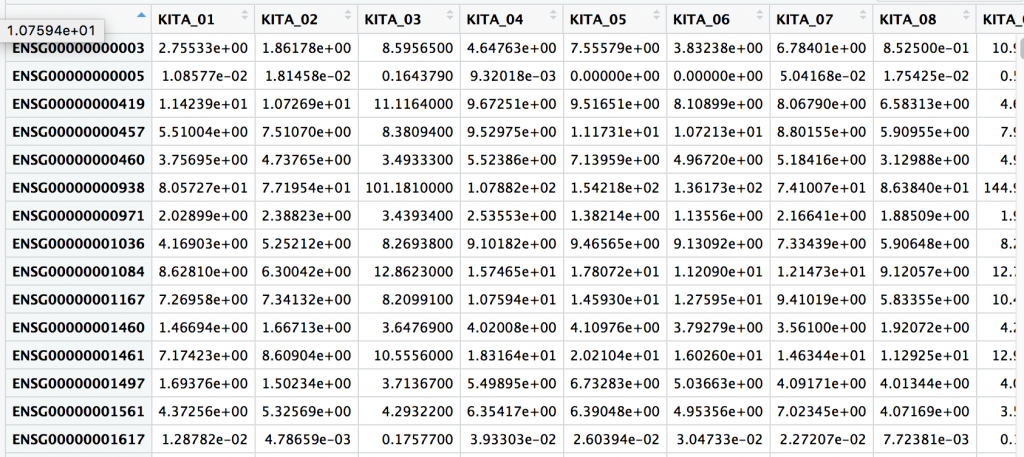

One thing we notice is that the UID, or unique ID is a column name for genes, and within the first rows of samples. UID’s are important concept and they are guaranteed unique row within a table, study, or in fact globally… or universally (UUID).
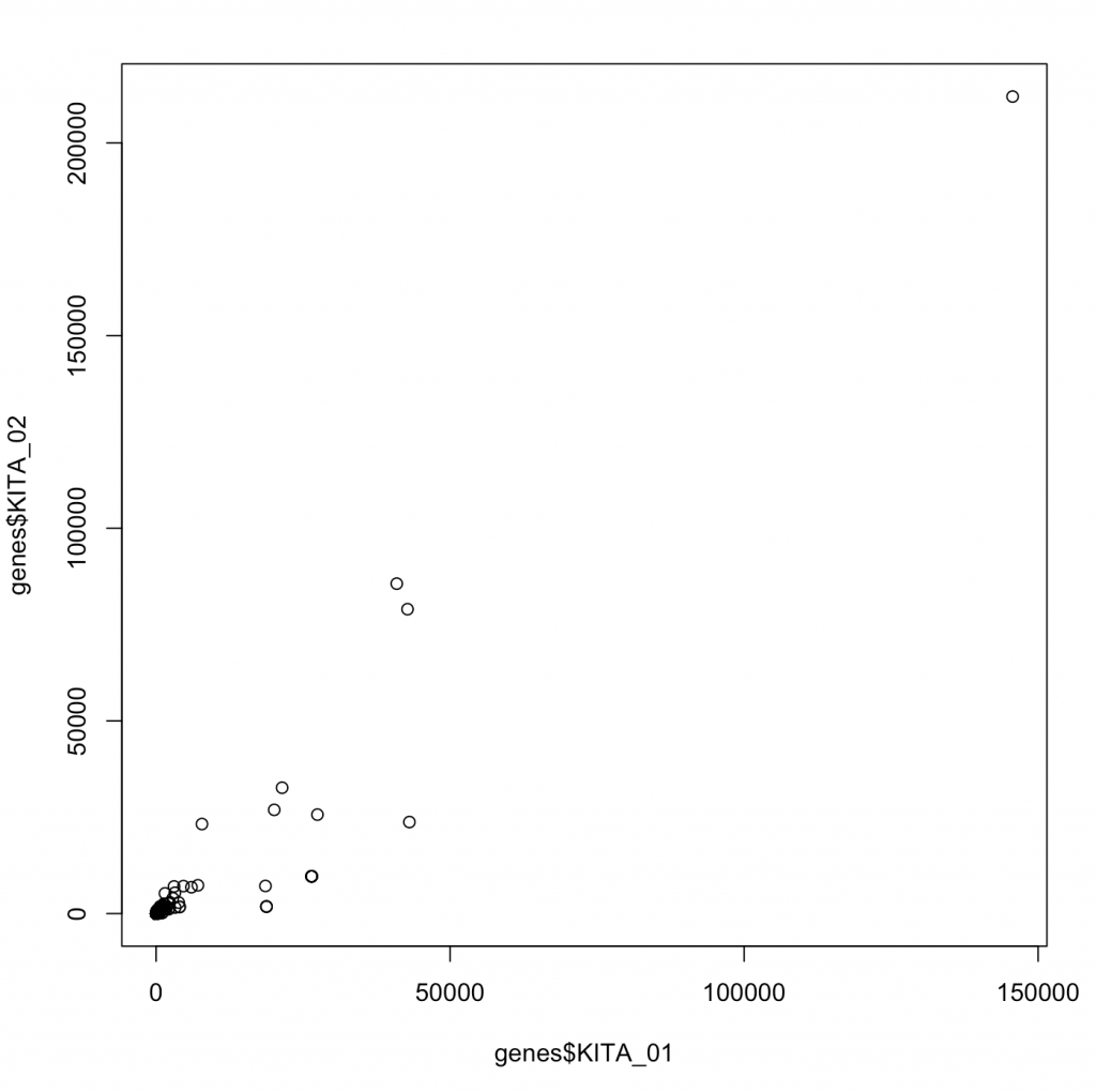
Lots understand the data we are looking at a little better, and graph genes for two different samples by putting:
plot(genes$KITA_01,genes$KITA_02)

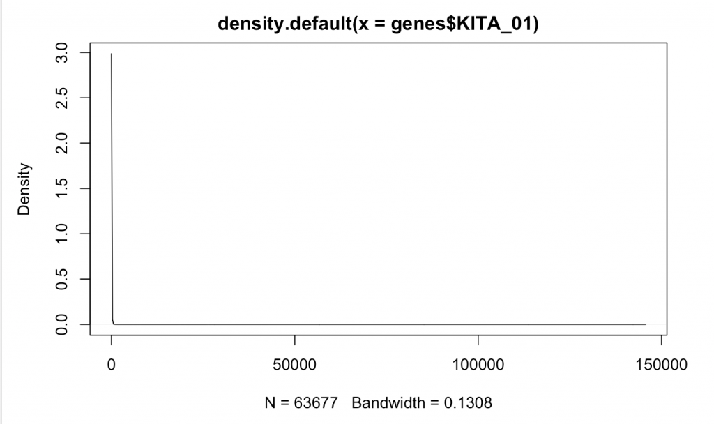
d <- density(genes$KITA_01) # returns the density data
 plot(d) # plots the results

Compare that to something more likely to be random normally distributed such as RIN for our samples:
d <- density(samples$RIN) # returns the density data
 > plot(d) # plots the results
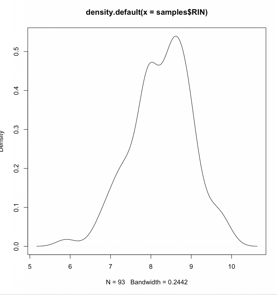

Clearly we aren’t normally distributed. Generally its wise to follow central-limit theorem when looking at data – or presume it to be non-parametric (Spearman), instead of parametric (Pearson). What we are doing is same as graphing on a log plot –
plot(density(log2(genes$KITA_01[(genes$KITA_01>0)])))
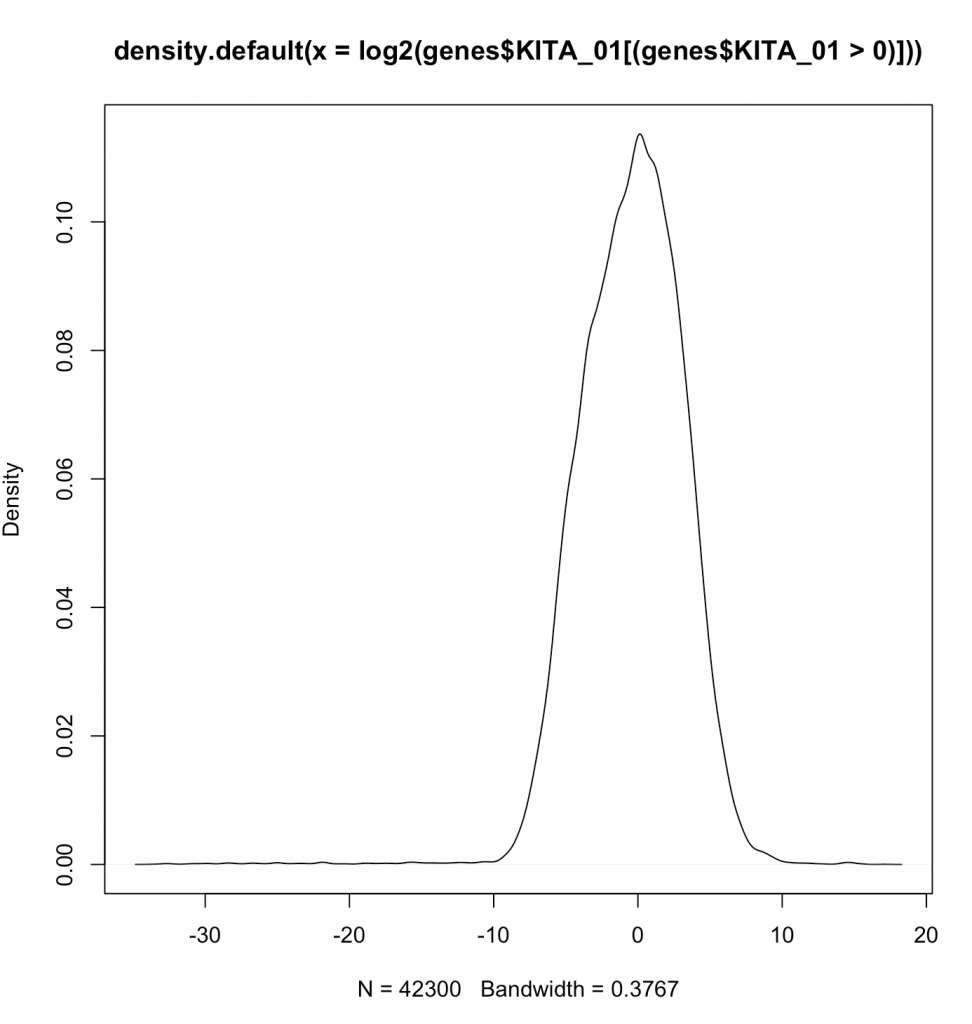

Aren’t log’s fairly magical at making things normal? Note that we are not showing the zeroes by the filtering done in line (genes$KITA_01>0). Now lets actually plot the log2 values.
plot(log2(genes$KITA_01[(genes$KITA_01>0 |genes$KITA_02>0 )]),log2(genes$KITA_02[(genes$KITA_01>0 |genes$KITA_02>0 )]))
Now we see a plot showing us how two random different genes correlate. If we wanted, we could calculate a Spearman correlation or a Pearson correlation. A Pearson correlates the values, and the Spearman correlates the rank. Generally, Spearman is robust to the values and does not suffer from “tale wagging the dog”. Calculating the Pearson correlation coeffecient (r2) tell us about the percentage of variance given the other.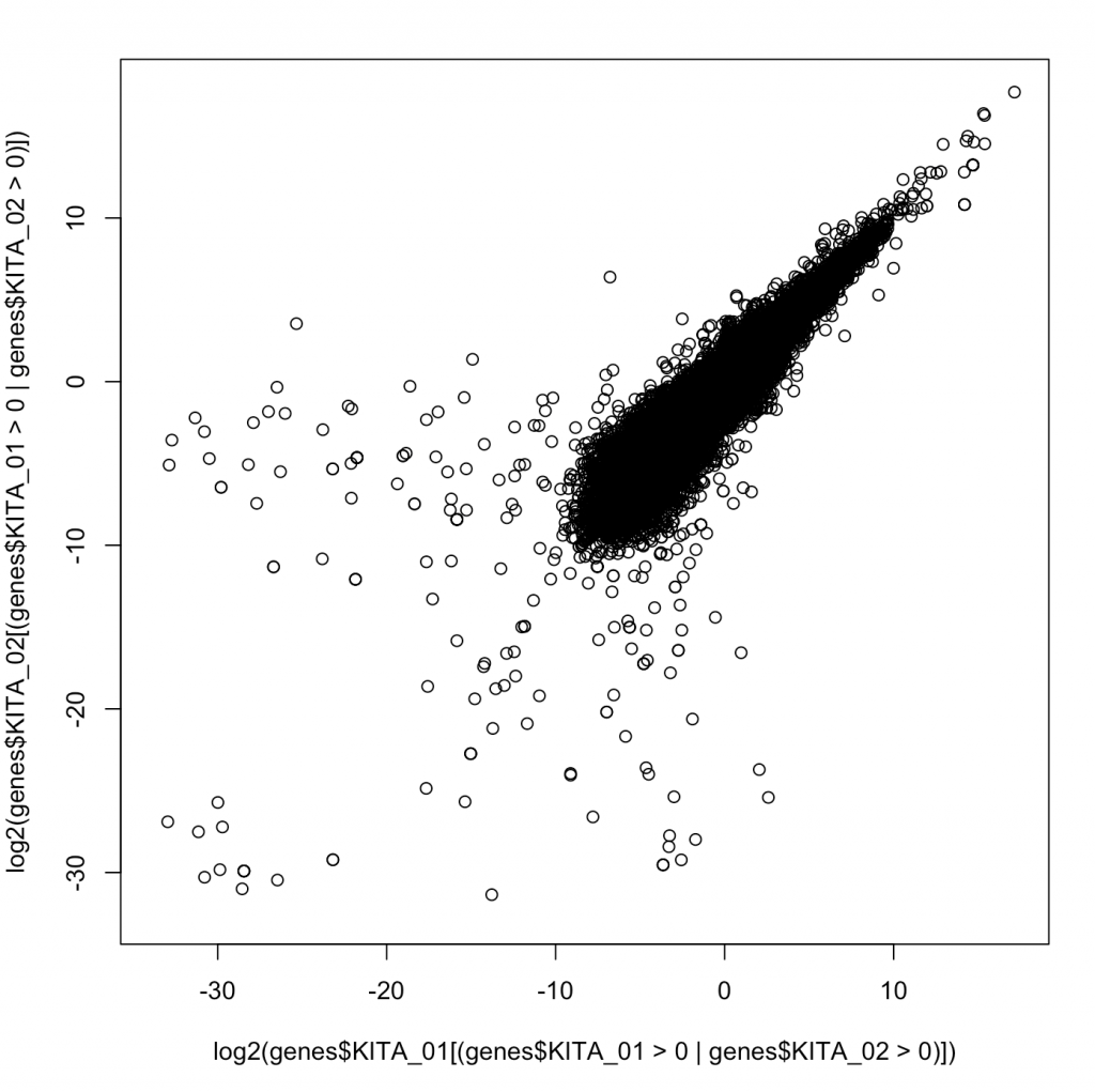

Ok – so in this case say that we wanted to create a dynamic range – how many orders of magnitude between the greatest and smallest value for each sample and then stores those in a new dataframe.
Lets use dplyr to make a new dataframe with some summary information.
samples$uid=rownames(samples)
genes_summary<-data.frame(
 UID=rownames(samples),
 min=minBySample <- sapply(genes, function(x) min(x[x > 0])),
 max=maxBySample <- sapply(genes, function(x) max(x))
 )
We introduce some major statistical ideas and present them with the knowledge that the best statistical tool should always be based on working with experts in biostatistics or following examples laid out in analogous high impact articles. In applied bioinformatics we are often not inventing a new analysis but rather following a pre-defined analysis approach. Still, its worthwhile to review some of the major tools that come up time and again.
Correlation. As we introduced above, correlation is generally a way to measure the strength of dependence of two variables on one another. By knowing on variable, how much do we know about another? One simple way to think about it as by percentage that one variable describes another variable. This is the correlation constant This is another way of thinking about r^2. R^2 is essentially the correlation coefficient. Sometimes, we just refer to r, without squaring, and thus this can go from -1 to 1 where -1 would be perfect inversely correlated. That is to say as one value goes up, another goes down. We are going to discuss this a few different ways, so do your best not to get hung up in the intricacies as that is not our goal in this course.
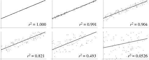

Also, as above there are many types of correlation coefficients that refer to correlating two vectors; or two samples. One type would be correlating the numbers as above, and this would be called a Pearson Correlation Constant. Another is to correlate their ranks, which provides a way to conduct correlation where the relative ranks of each value are correlated. This is called a Spearman Correlation Constant. Spearman’s are appropriate whenever there is concern that the data is not “normally distributed”. At a high level, if one would make a histogram of the data of the data it can provide us insight.
In the dataset we are using to learn there are 93 samples. What if we took and measured the correlation constant between all samples? This would create a 93 by 93 matrix of correlation values. A function to help us with this would be “cor” in R, and we can apply it to genes.
corr<-cor(genes)
We can type `corr` to display it within the console, and we see something like this (shown for only 6 samples):
 KITA_01 KITA_02 KITA_03 KITA_04 KITA_05 KITA_06
KITA_01 1.0000000 0.9172325 0.7059474 0.7890462 0.8727615 0.7956106
KITA_02 0.9172325 1.0000000 0.6796419 0.8972362 0.9245204 0.9117325
KITA_03 0.7059474 0.6796419 1.0000000 0.7943030 0.7975012 0.7706625
KITA_04 0.7890462 0.8972362 0.7943030 1.0000000 0.9774844 0.9919876
KITA_05 0.8727615 0.9245204 0.7975012 0.9774844 1.0000000 0.9828198
KITA_06 0.7956106 0.9117325 0.7706625 0.9919876 0.9828198 1.0000000
We note that the obviously when one variable is perfectly correlated to itself, just as we would expect.
Now we can’t see the matrix easily, and honestly they are difficult to compute. We could reshape this as a list of pairs and that would be easier. This is core to the concept of “melt”, which turns a square matrix, into minimal (in this case pairwise) compoents.
melted_corr <- melt(corr)
 head(melted_corr)
The second command provides us the first few lines to get the idea of what is happening.
X1 X2 value
1 KITA_01 KITA_01 1.0000000
2 KITA_02 KITA_01 0.9172325
3 KITA_03 KITA_01 0.7059474
4 KITA_04 KITA_01 0.7890462
5 KITA_05 KITA_01 0.8727615
6 KITA_06 KITA_01 0.7956106
We can actually visualize this as a heatmap to better view:
ggplot(data = melted_corr, aes(x=X1, y=X2, fill=value)) +
 geom_tile()
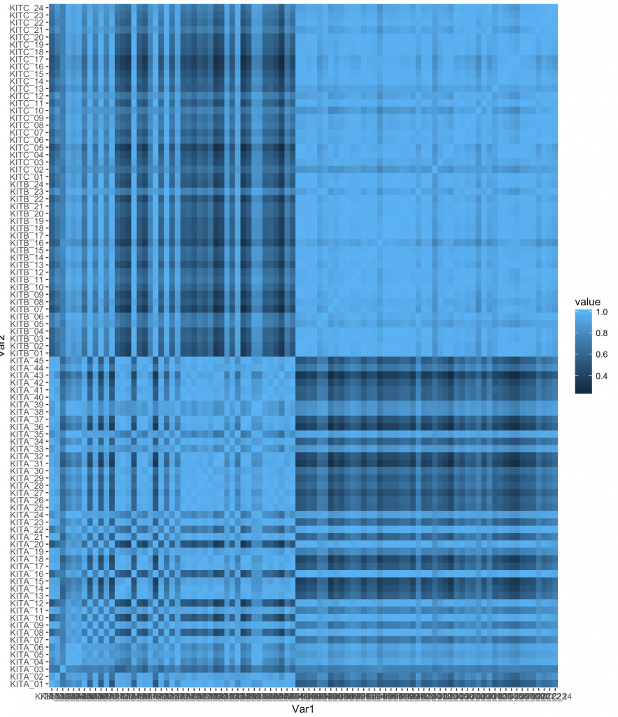

However, we can do quite a bit and its best to find examples on the web. One example I found was:
ggplot(melted_corr , aes(x = Var1, y = Var2)) +
 geom_raster(aes(fill = value)) +
 scale_fill_gradient2(low="navy", mid="white", high="red", midpoint=0.5) + theme_classic()
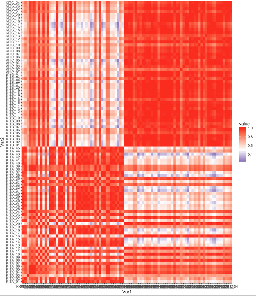

Now one thing we notice is that there are some samples that are like other samples. In fact we see the default organization of the samples shows some all like each other near top, and some that are different.
We are going to need to install a few libraries. See below:
install.packages('devtools')
devtools::install_github('hadley/ggplot2')
install.packages('reshape2')
Lets use a different library, “plotly” which adds additional functionality to ggplot. You may need to install the plotly packages via install.packages(‘plotly’) and some individuals may be requested to install development version of ggplot, you can do this via: install_github(“ggplot2”, “hadley”, “develop”). Here we remove some labels and make it work with hovering. The entire block is:
library(ggplot2)
library(reshape2)
corr<-cor(genes)
melted_corr <- melt(corr)
p<-ggplot(melted_corr , aes(x = Var1, y = Var2)) + geom_raster(aes(fill = value)) + scale_fill_gradient2(low="navy", mid="white", high="red", midpoint=0.5) + theme( plot.title = element_blank(),axis.text.x = element_blank(), axis.text.y = element_blank(), axis.title.y = element_blank(), axis.title.x = element_blank())
ggplotly(p)
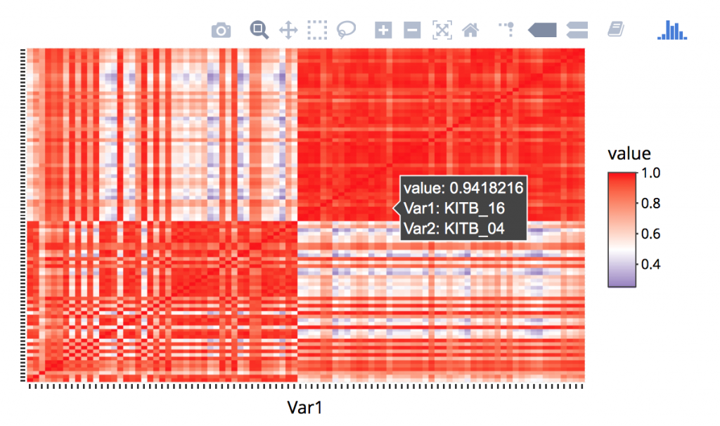

One concept is supervised vs unsupervised analysis methods. Supervised methods are when you identifying classes using algorithms and unsupervised is when we are identifying classes that are assigned. In the case of our data, the supervised classes are “Kit”. Unsupervised groups will be identified through algorithms. One such algorithm is Hierarchal clustering.
Rogue PCA Steps
- ```{r}
- pcadf<-prcomp(genes, center = TRUE,scale. = TRUE)
- pcadf<-data.frame(pcad$rotation)
- ```
- ```{r}
- library(dplyr)
- samples$uid<-rownames(samples)
- pcadf$uid<-rownames(pcadf)
- samples<-inner_join(samples,pcadf,by="uid")
- ```
- ```{r}
- plot_ly(samples, x = ~PC1, y = ~PC2, z = ~PC3, size=~reads,marker = list(symbol = 'circle', sizemode = 'diameter'), sizes = c(5, 25), color = ~Kit) %>%
- add_markers() %>%
- layout(scene = list(xaxis = list(title = 'PC1'),
- yaxis = list(title = 'PC2'),
- zaxis = list(title = 'PC3')))
- ```
Joins and other functions
We refer to our DPLYR spreadsheet, but we note that these are data base functions common in tables. We want to join in our PCA Analysis and maybe color by something related to the sample. Here is some info on joining from the cheatsheet.
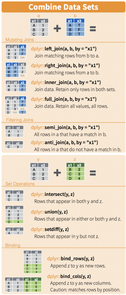

Now we are just introducing joins, and they are important with databases. There are three concepts to think about when merging tables. Sometimes they have the same rows and sometimes they don’t. In this case, its easy because they do. Still lets do an inner join.
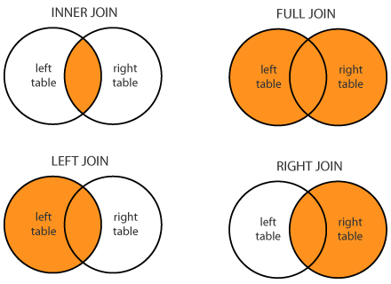

We know the first thing we need to do is to have a common column to join on. When we look at the samples dataframe, you’ll notice there is no column, but that the rownames are what we want to join on. So lets make it easy and create a new column with these rownames
samples$uid<-rownames(samples)
pcadf$uid<-rownames(pcadf)
samples<-inner_join(samples,pcadf,by="uid")
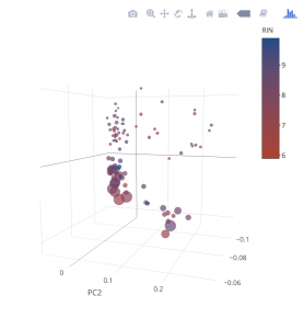
Now lets make our graph a little more informative. That’s five dimensions for those counting
- plot_ly(samples, x = ~PC1, y = ~PC2, z = ~PC3, size=~reads,marker = list(symbol = 'circle', sizemode = 'diameter'), sizes = c(5, 25), color = ~RIN, colors = c('#BF382A', '#0C4B8E')) %>%
- add_markers() %>%
- layout(scene = list(xaxis = list(title = 'PC1'),
- yaxis = list(title = 'PC2'),
- zaxis = list(title = 'PC3')))
